skip to main |
skip to sidebar
Classic Transitional Bathroom Plans
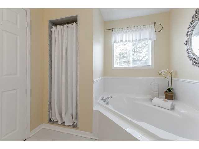
As soon as we moved into this house last December we knew our first big remodel project was going to be the master bathroom. It was a typical 90s builder grade with no personality. Our last house was an old Victorian and I loved all of the traditional character of the space, so I was itching to bring some of that classic style to life in our new home while keeping the tones and finishes modern. Here is a look at the master ensuite before, and the plans for our classic transitional bathroom makeover!
Before - 90s Builder Ensuite Bathroom
To give you an idea of where we were starting from, here are the photos from the original listing. The shower felt like a submarine closet, the pedestal sink offered zero storage, and the corner tub layout took up valuable space.
The Plan - Classic Transitional Ensuite Oasis
On our wish list structurally for our master bathroom were three things: a double sink vanity with plenty of storage, a larger glass shower to open and brighten up the space, and a free standing tub. I love the fresh and clean feeling of bright white bathrooms, but knew I wanted to keep it from looking sterile or plain so I made some bolder tile choices to add some interest to the design. Here is what we landed on for our ensuite plan:
The room itself isn't huge so space planning was extremely important to make sure we could fit in all of the features we wanted. I found some free tools online to help me create a space plan and rendering with similar fixtures and finishes (more on that soon!) to help give me a wholistic view of what we wanted to show our contractor. We're now through the major construction phase and I can't wait to show you more once we've completed the final details!
What is your favourite interior design style?
keep up with me: bloglovin' | instagram | pinterest


No comments:
Post a Comment